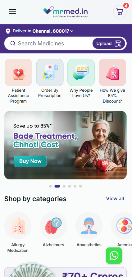
MrMed
Pharmaceutical app | Mobile Redesigns
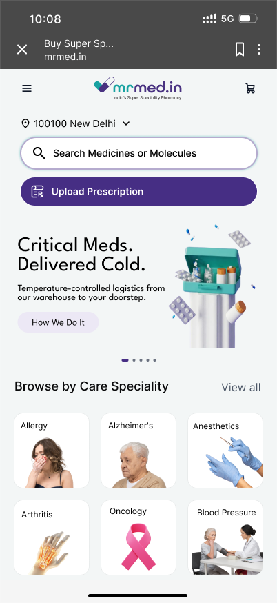
MrMed users are patients and caregivers navigating fear, anxiety, shame, and loss of control. The new design takes up a modern UI approach, aiming for visual and emotional clarity for the user.
 arrow_forward
Research & Discovery
- Analyzed competitor apps (1mg, PharmEasy, Netmeds) for strengths and gaps
- Reviewed internal user feedback and common drop-off points
- Created user personas: anxious first-time users, busy caregivers, elderly patients with family support
- Mapped current user journeys and identified friction points in search, product details, and checkout
Design Process
I started with low-fidelity wireframes to simplify navigation and information hierarchy. Iterated through multiple rounds based on stakeholder feedback, focusing on:
- Emotional Design: Soft color palette (trustworthy greens and calming neutrals), generous whitespace, and reassuring microcopy.
- Clarity: Simplified medicine cards, prominent safety information, and progressive disclosure of complex details.
- Efficiency: Reduced steps in critical flows (search → product view → cart → checkout).
- Accessibility: Larger touch targets, high contrast, and clear typography for all age groups.
Throughout the process I maintained close collaboration with the product and engineering teams to ensure feasibility.
Key Solutions
1. Medicine Discovery & Search
Redesigned search with smart suggestions, category filters, and clear comparison options. Added trust signals (prescription requirements, expiry info) directly on cards.
2. Product Detail Page
Organized complex medical information into scannable sections with expandable areas. Included easy-to-find alternatives and AI-suggested substitutes (future scope).
3. Refill & Cart Experience
Streamlined refill flow with one-tap options for previous prescriptions and visual progress indicators to reduce abandonment.
4. Overall Interface
Modern, breathable UI that feels caring rather than clinical.
Outcomes & Impact
- Presented final designs to stakeholders and received positive feedback on improved clarity and emotional tone
- Key flows simplified (e.g., refill process reduced by ~40% in steps)
- Created a scalable design system component library for future use
Learnings & Reflections
This internship taught me how design can directly reduce user stress in high-stakes domains like healthcare. I learned to balance business goals with deep user empathy and to advocate for user needs in a corporate environment.
Future Opportunity with AI: I’m especially excited about extending this experience with AI features — such as conversational medicine assistants, personalized adherence reminders, explainable drug interaction predictions, or symptom-based recommendation tools. My Data Science background would allow me to collaborate effectively on such features.
Check out the prototype yourself
This is an ongoing project. Details coming soon.
Thank you for reading!