RDS Status Website
Internal Tasks | UIX
The Problem
The Real Dev Squads website is open-source and the internal tasks are visible to anyone. The Status Website is used as a Task Manager internally in the team.
The RDS Status Website has two main issues:
- Scattered Functionality: The ability to view all tasks, individual tasks, and create new tasks (TCRs) is spread across various "Status" tabs and the "Profile" dropdown, making it difficult to find.
- Confusing Terminology: The word "Status" is used repeatedly on the website to mean different things, such as the status of the entire RDS team, the status of individual team members (idle or out of office), and the progress status of specific tasks (in progress, completed). This inconsistent use of the term leads to confusion.
Defining the Problem Area:
                    graph LR
                        A[Status]:::blue
                        A --> B[Tasks]:::blue
                        A --> C[Issues]:::blue
                        A --> D[Mine]:::blue
                        A --> E[Open PRs]:::blue
                        A --> F[Stale PRs]:::blue
                        A --> G[Idle Users]:::blue

                        classDef blue fill:#C2E5FF,stroke:#3DADFF,stroke-width:2px,color:#333,font-family:'Inter';
                    graph LR
                        H[Profile Dropdown]:::teal
                        H --> I[Home]:::teal
                        H --> J["Status (Idle/ OOO)"]:::teal
                        H --> K[Profile]:::teal
                        H --> L[Tasks]:::teal
                        H --> M[Identity]:::teal
                        H --> N[SignOut]:::teal

                        classDef teal fill:#C6FAF6,stroke:#5AD8CC,stroke-width:2px,color:#333,font-family:'Inter';
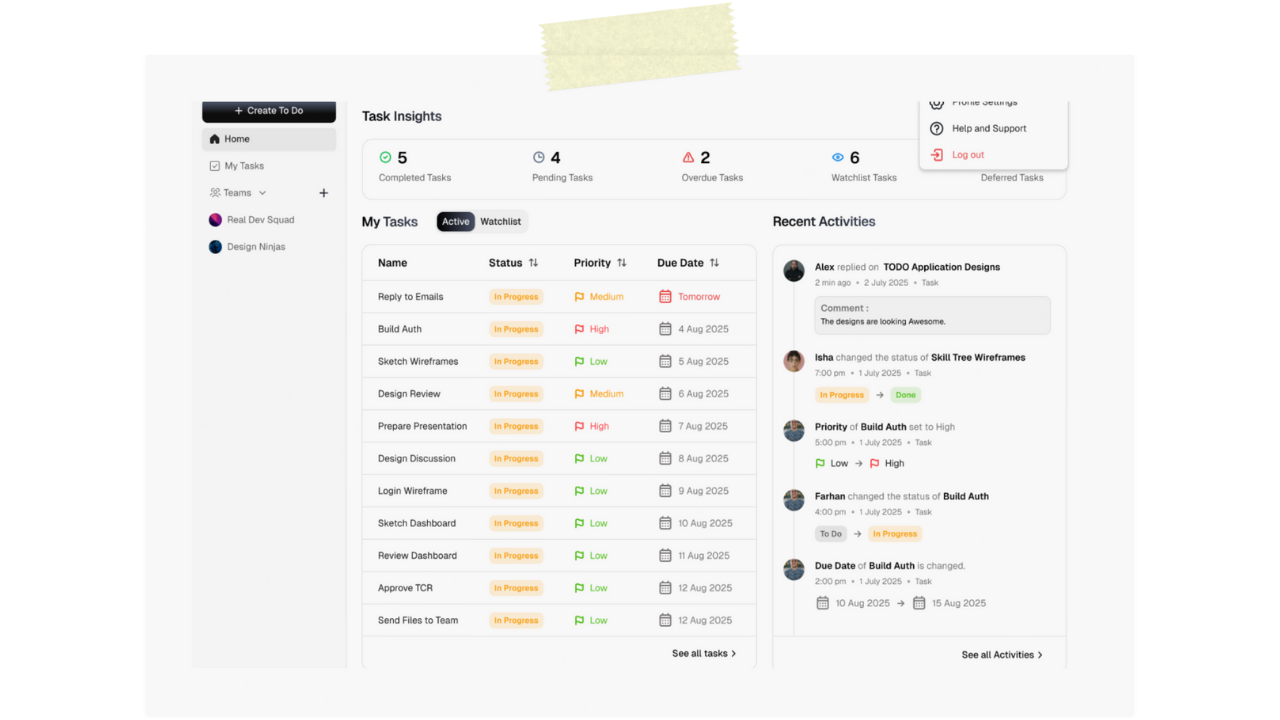
The Solution(s)
I proposed two solutions. 1. A major revamp. 2. Resource-bound Quick Fix
The Big Revamp
- The TCR process would be universally shortened...
- The RDS Website would be for information only, i.e. 'read only'.
- Designers and non-devs would no longer have to raise GitHub issues...
- In the Stride app, developers would have the GitHub options...
The Quick Fix
- Status Tab Renaming and Reorganization: Main Tab "Status" will be renamed to "Tasks."
- "My Tasks" Functionality: Clicking on "My Tasks" will open the same view...
- Profile Management: The existing Profile dropdown will be removed...
Final Flow
                    graph LR
                        A[Status]:::blue
                        A --> B[All Tasks]:::blue
                        A --> C[My Tasks]:::blue
                        A --> D[Issues]:::blue
                        A --> E[Open PRs]:::blue
                        A --> F[Stale PRs]:::blue
                        A --> G[Idle Users]:::blue

                        classDef blue fill:#C2E5FF,stroke:#3DADFF,stroke-width:2px,color:#333,font-family:'Inter';
                    graph LR
                        H[Profile Dropdown]:::teal
                        H --> I[Profile]:::teal

                        classDef teal fill:#C6FAF6,stroke:#5AD8CC,stroke-width:2px,color:#333,font-family:'Inter';
Figma Prototype
Check out the interative prototype yourself.
Old vs New
Old Flow
New Flow
Conclusion
- Improved UI with more visual cues like colored hover indicating progress of a task, along with badges.
- Improved user flow with less clutter and relevant information and options at one place.
Thanks for reading this case study <3
Check out my other projects
Stride (ToDo app by RDS)
arrow_outward
Preppal
arrow_outward
MrMed mobile website redesign
arrow_outward